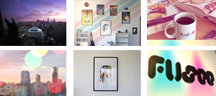
Deciding the name of our agency was very hard for the team but giving it it’s form was harder. The corporate font of Fusee have to be special so instead of using something old school stuff, the team created an unique typography. Every line, every curve, every letter that has been created reflects the spirit of the agency. The soul has already been well made, after this process so does the flesh…

